 Laxmishree Banerjee
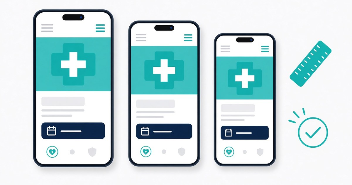
A medical website may look polished on a desktop but become difficult to use on a smartphone. Navigation menus can overlap content, appointment buttons may be hard to tap, forms can require excessive scrolling, and medical information may become difficult to read.
For patients trying to find a doctor, check clinic hours, understand a service, or request an appointment, these problems create unnecessary friction. They can also make it harder for practice teams to convert relevant website visits into enquiries.
Testing medical website common mobile screen sizes helps practice owners, website managers, and healthcare UX teams identify these usability issues before they affect more visitors. The process should go beyond checking whether a page fits on a smaller screen. It should confirm that important tasks remain easy to complete across different devices, browsers, and orientations.
A practical approach to medical website design combines responsive layouts, readable content, accessible controls, reliable forms, and privacy-conscious testing. These checks support a better patient experience and provide a sound foundation for healthcare digital marketing.
Why Mobile Usability Matters for Medical Websites?
Patients may access a clinic website while travelling, comparing providers, checking directions, or trying to contact a practice outside normal working hours. They need essential information to remain accessible without excessive zooming, horizontal scrolling, or repeated navigation.
Google uses the mobile version of a website’s content for indexing, making mobile content and accessibility important considerations for search visibility. Its guidance recommends responsive design as an approach that adapts layouts to different screen sizes.
However, mobile usability is not only an SEO concern. A visitor who cannot find a telephone number or submit an appointment request may abandon the task regardless of how well the website performs in search results.
The objective is to ensure that patients can complete essential tasks comfortably on the devices they actually use.
How to Test Common Mobile Screen Sizes
Testing should cover a range of viewport widths, not just one popular phone. A responsive website may behave differently on a narrow phone, a larger smartphone, a tablet, or when a device rotates into landscape orientation.
Use these as practical test widths rather than a definitive list of device models:
| Test viewport | What to check |
|---|---|
| 320–360 CSS pixels | Narrow-screen text wrapping, menu layout, and horizontal overflow |
| 375–390 CSS pixels | Common smartphone layouts, appointment buttons, and form fields |
| 412–430 CSS pixels | Wider phone layouts, spacing, and card alignment |
| 600–768 CSS pixels | Small tablets, breakpoints, and navigation transitions |
| Landscape orientation | Content height, sticky elements, pop-ups, and form usability |
These are suggested testing ranges, not a claim that every patient device falls within them. CSS viewport width also differs from a phone’s physical pixel resolution.
Step 1: Test responsive layout and navigation
Open key pages at each viewport size using browser developer tools, then confirm important pages on physical devices where possible.
Check whether the logo, menu, headings, images, and content blocks fit without overlapping. Navigation should be easy to open, close, and operate with touch. Sticky headers and cookie notices should not cover appointment buttons or important content.
Also test the full page for accidental horizontal scrolling. Tables, maps, embedded booking widgets, and oversized images are common places to look for layout problems.
Step 2: Check readability and accessibility
Read the page at its default zoom. Body text should be comfortable to read, headings should establish a clear hierarchy, and paragraphs should not become excessively wide or cramped.
Check contrast, visible keyboard focus, meaningful link labels, image alternatives, and form labels. Do not rely on colour alone to communicate errors or required fields.
The Web Content Accessibility Guidelines (WCAG) 2.2 include a minimum target-size criterion of 24 by 24 CSS pixels, subject to stated exceptions. Larger touch targets are often more comfortable for important actions such as calling a clinic or requesting an appointment.
Step 3: Test forms and appointment journeys
Use a test environment or approved test records to complete the main patient-facing tasks.
Check that:
- Each field has a clear label and suitable input type.
- The correct mobile keyboard appears for phone numbers, email addresses, and dates.
- Required fields are identified before submission.
- Validation errors explain what needs correcting.
- Entered information remains available when a correctable error occurs.
- The submit button remains visible and responds to a single tap.
- Success and failure messages are clear.
- Confirmation pages, booking links, and telephone links work correctly.
A form that looks correct but fails to submit is a critical usability defect. Verify the underlying submission process rather than relying on visual inspection alone.
Illustrative Example: Testing a Clinic Appointment Page
Imagine a hypothetical clinic whose appointment page works correctly on a desktop but causes problems on a narrow smartphone.
During testing, the team discovers that the navigation menu covers the booking button, a date field is difficult to operate, and the form displays an error without explaining which field needs correction.
The team should record each defect, its severity, the device or viewport where it occurs, and the steps needed to reproduce it. After correcting the issues, it should repeat the same tests and confirm that the full appointment journey works.
Use this checklist to document the results:
| Test area | Pass condition |
|---|---|
| Navigation | Menu opens, closes, and links work |
| Readability | Text wraps without clipping or overlap |
| Contact options | Phone and booking links work as intended |
| Forms | Fields, validation, submission, and confirmation work |
| Accessibility | Controls are labelled, and keyboard focus is visible |
| Content | Essential service and clinician information remains available |
| Layout | No unintended horizontal scrolling |
| Performance | Main content and key controls load reliably |
Common Mistakes and Privacy Considerations
Testing only on the developer’s own phone can miss problems caused by different viewport widths, browsers, operating systems, text settings, and network conditions. Browser emulation is useful, but it does not fully reproduce every physical device or assistive technology.
Other common mistakes include:
- Checking only the homepage rather than service pages, clinician profiles, contact pages, and booking flows.
- Assuming that a page is accessible because its text fits the screen.
- Ignoring error states, slow connections, or third-party booking widgets.
- Removing important service content from mobile layouts to make pages shorter.
- Testing forms using real patient information when synthetic test data would suffice.
For healthcare websites, privacy must be part of the test plan. Use dummy names, test telephone numbers, and non-sensitive test submissions wherever possible. Ensure test data does not enter production patient records or trigger real appointment confirmations unnecessarily.
Review consent notices, form data handling, analytics tags, and access permissions. Do not capture or share identifiable patient details in screenshots, bug reports, or session recordings without appropriate authorisation and safeguards.
Google’s mobile-first indexing guidance also advises maintaining equivalent primary content across mobile and desktop versions. Important medical information should not disappear simply because the layout changes.
How to Evaluate Progress and Decide What to Fix First?
A useful mobile audit ends with a prioritised list of defects, not just a collection of screenshots.
Prioritise issues that prevent patients from completing essential tasks. A broken appointment form or an inaccessible telephone link should generally be addressed before a minor spacing inconsistency.
After changes, compare the same viewport sizes and repeat the same user journeys. Track:
- Number of critical and high-priority defects resolved.
- Successful completion of appointment and enquiry tasks.
- Form validation and submission errors.
- Mobile page performance and loading problems.
- Relevant mobile visits and completed enquiries, where analytics is reliable.
Compare website analytics before and after changes, but account for traffic mix, seasonality, and other site updates. An increase in enquiries does not prove that a specific design change caused it. Likewise, a technically successful audit does not guarantee improved search rankings or patient acquisition.
Final mobile usability checklist
- Test narrow, standard, and wider phone viewports.
- Check tablet layouts and landscape orientation.
- Verify navigation, readable text, and touch controls.
- Complete appointment and contact forms from start to finish.
- Confirm that important medical content remains available.
- Check accessibility, performance, and third-party components.
- Use synthetic test data and protect patient privacy.
- Re-test fixes and document any remaining limitations.
Conclusion
Testing medical website common mobile screen sizes is an ongoing quality-assurance process, not a one-time visual check. By testing real tasks across different viewports, healthcare teams can find barriers in navigation, readability, and appointment journeys before they affect more visitors.
Effective medical website design supports both usability and discoverability. As part of a broader healthcare digital marketing strategy, regular mobile testing helps keep the website accessible, reliable, and aligned with the needs of patients and practice teams.


 admin